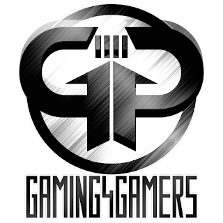
Here's a look at the completed logo before the explanation...
 |
| completed logo (round) no text |
 |
| logo on white background |
 |
| logo on black background |
After another discussion with G4G and wanting some changes to the logo, the below logo was the next revision...
 |
| logo after the subtle changes |
 |
| revised logo with text |
 |
| round logo variant |
 |
| round logo variant with text |
The way in which I have designed the logo allows for an easy change of hue in order to colorize the logo to any possible color... examples below.
 |
| logo colorized |
 |
| logo colorized and inverted |
All in all, I spent a fair amount of time and effort in creating this logo, so I hope it now gets used to brand G4G, aka Gaming4Gamers.
Like what you see? Want something designed for yourself or your clan or company? Feel free to contact me via any of my social media so we can discuss further.
Thanks for reading.
-soul.
![soul[kobk]](https://blogger.googleusercontent.com/img/b/R29vZ2xl/AVvXsEjRiMmltqmlQdeYN71Sy5dNnjTjSR9fu_CLeJxqu2vZ7je7EkPGB0c8Rjxzwn0J8zFAgODKIkXbf5AxVB6huuz4m2SqQGC8AzNz690t6O_5MwWkJdcdzqWhbkRoTX5jfwze0gDp1jm4B9A/s1600/soulkobk-logo-192x51px.png)


